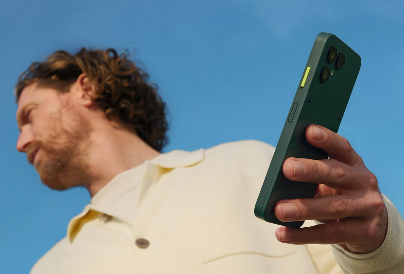

A bold new identity and international campaign for Fairphone
With the launch of the Fairphone (Gen. 6), we introduce a refreshed visual identity and a pan-European digital-first campaign. The new look expresses the balance between high performance and human simplicity, positioning Fairphone as both innovative and fair.


The neon button at the core
At the center of the identity is the neon button, symbolising the switch between performance and Fairphone Moments. This element anchors the rebrand across logo, colors, typography and messaging. A refreshed, confident color palette adds a contemporary edge while reinforcing Fairphone’s vision of technology that is both smart and human.


A digital-first approach
The campaign comes to life through videos with clear visuals and bold headlines. Rolling out across the Netherlands, Germany, France and the UK, it delivers tailored stories and assets for each audience and platform. Just like our modular phone, the campaign is designed to be flexible and adaptive, always putting clarity, accessibility and impact first. A strategic funnel ensures every touchpoint guides audiences seamlessly from first contact to final purchase.


Technology with humanity
Our new identity is clean, contemporary and future-facing, yet always human at its core. By combining striking visuals with inspiring storytelling, the campaign marks a new chapter for Fairphone and its growing community across Europe.


