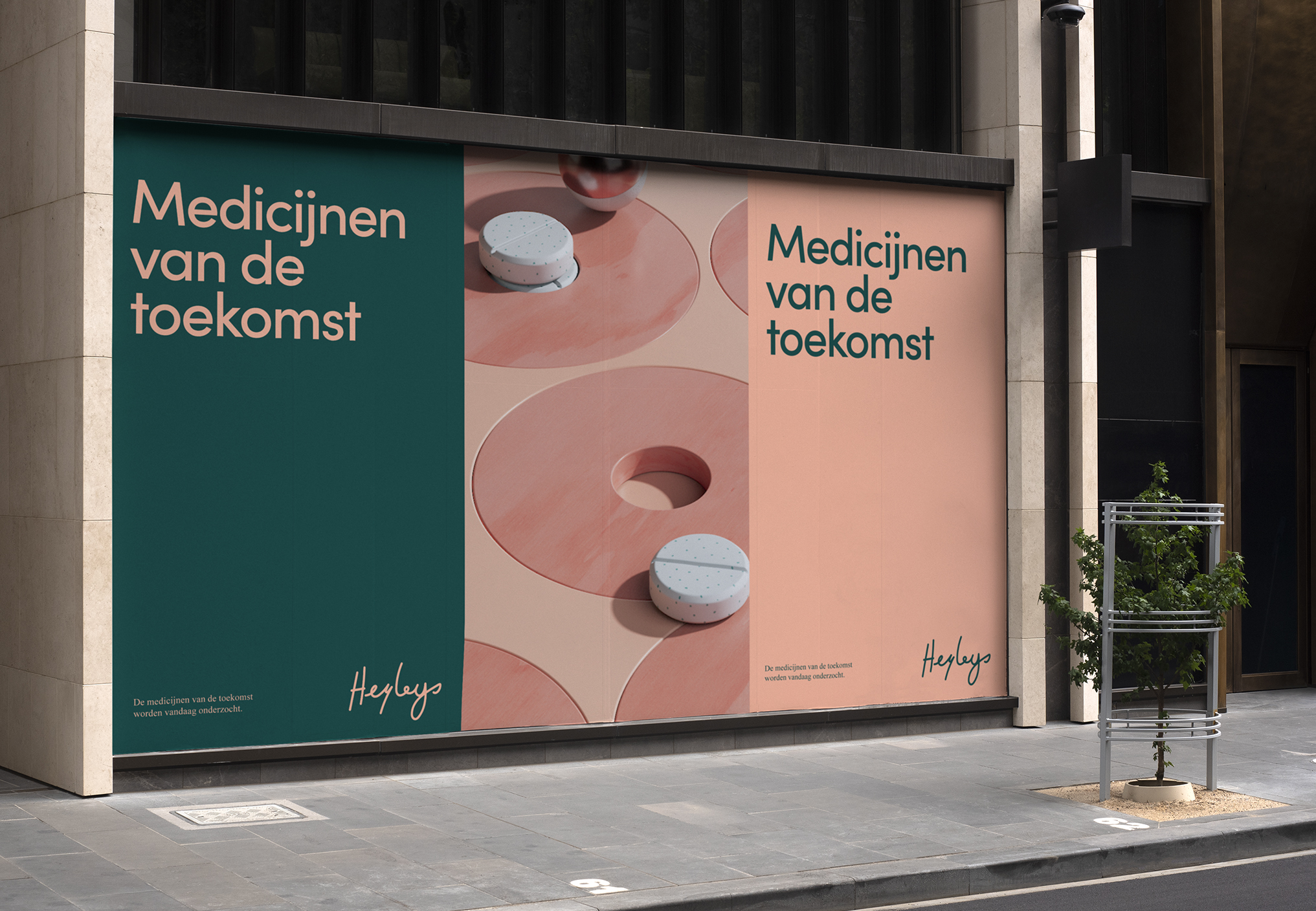
Cancer research identity
Connecting cancer research directly to patients? It starts with the right name: Heyleys. A feminine and personal name, lowers barriers and makes our platform accessible.
The logo had to be inviting and related to cancer research. That’s why we honor Nobel prize winning researchers in the field in our design. And gave it a personal touch by using their handwriting as a starting point.


Medication is hero
The visual identity continues our tribute to medical research. Making cancer medication the hero. It puts medication on a pedestal by visualising it in gold.

Visualising medication
The campaign connects the history of cancer research with our identity. Making sure everything ends on a positive note for days to come:
The cancer medication of the future is discovered today. Let’s make it accessible for everyone.


